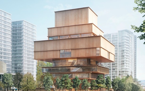
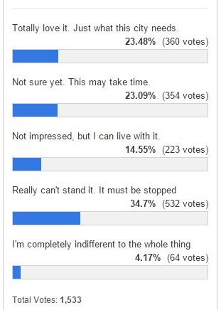
The design for the new Vancouver Art Gallery has been published, and although so far opinions are split widely about designers Herzog & de Meuron’s vision, the largest voting segment on CBC’s poll is, “Really can’t stand it. It must be stopped.”
Of 1,533 voters 532 said they “couldn’t stand” the new design. Very few of those who responded said they were “indifferent” (4 percent). About 15 percent said they were “not impressed” but could live with it. 23 percent said they “weren’t sure yet and needed time.” The same percentage — a quarter of respondents — said they “totally loved” the design.
Some Canadians criticized the design as looking like a pagoda, being outdated in style, and being built “like Lego.” Some also referred to the inukshuk, a traditional indigenous Canadian symbol popular in the city. Those who approved of the design said it was “exciting” and “something cool happening in Vancouver.”
A lot of commenters expressed strong feelings about the designers chosen not being Canadian.
“It does not look Canadian or West Coast! Don’t we have a West Coast architect with a Canadian design?” wrote one such commenter.
The new plan is a 310,000-square-foot wood design 20 stories high, and would be built in downtown Vancouver on the site of what is currently a parking lot at West Georgia and Cambie Street.
The site was donated by the city on condition the Vancouver Art Gallery would raise an estimated $300 million needed for the project. So far, funds raised fall far short of that. $23 million has been vouched by the Vancouver Art Gallery board of trustees.
The designers were chosen in 2014. World class designers Herzog & de Meuron have done a number of famous art galleries and museums around the world, including the Tate Modern in London and the “Bird’s Nest” in Beijing.
Participate in the poll (click) or comment (below).

