Indignation In Mexico Over Killing Of Photojournalist 

Share this
Share

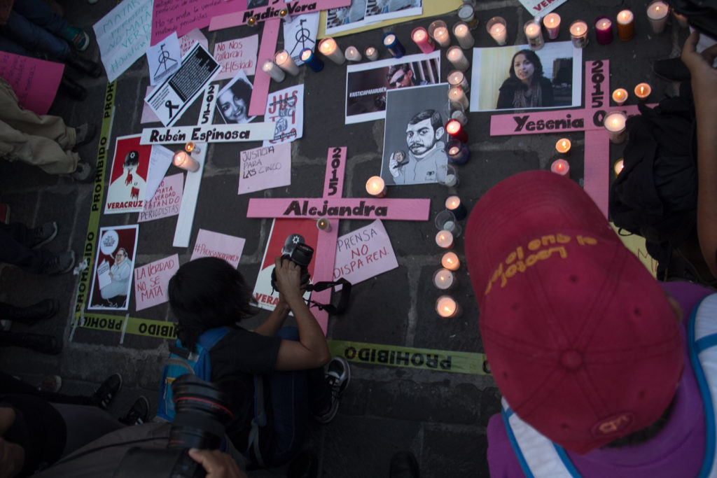
PUEBLA, México — A Mexican news photographer was among five people found dead in the middle-class neighborhood of Narvarte, Mexico City, July 31.

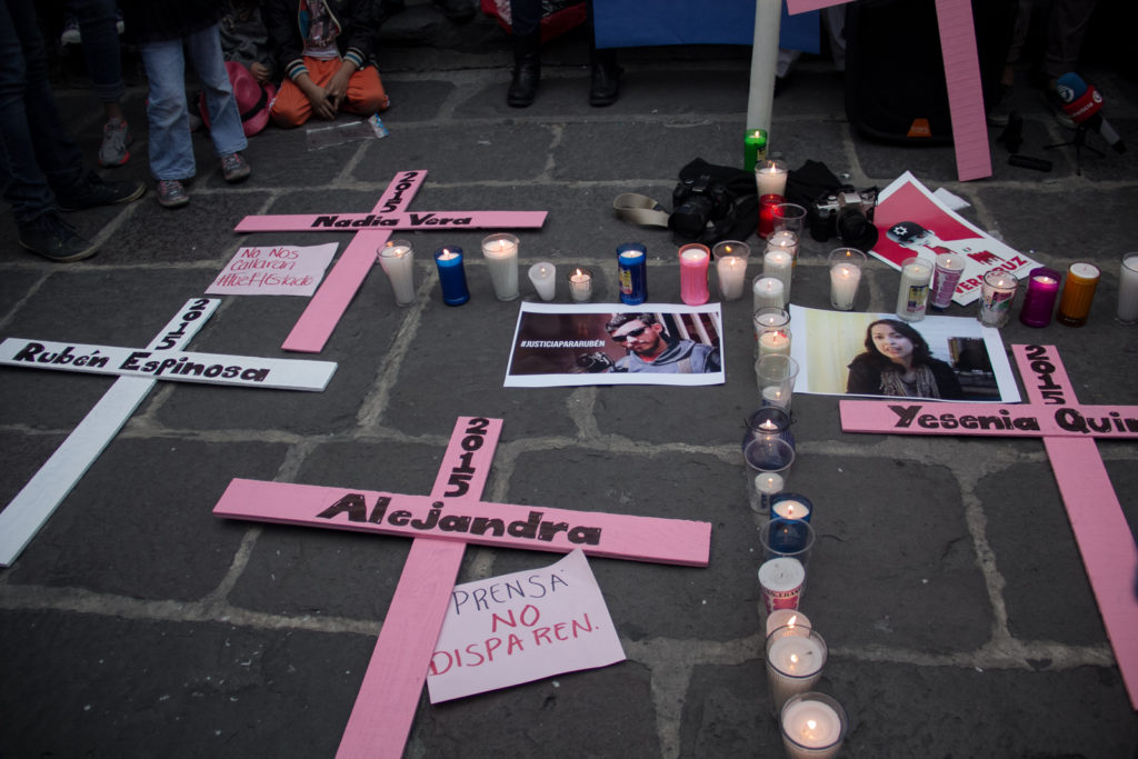
Rubén Espinosa, former member of Proceso and collaborator with the news agencies Cuartoscuro and AVC News was among five victims discovered by police beaten and shot in the head; a month ago, Espinosa claimed in interviews that he felt threatened by the governor of Veracruz state, Javier Duarte.

Veracruz is one of the most dangerous Mexican states for journalists, with a total of 13 killed under Duarte’s watch. Espinosa is the seventh journalist killed in Mexico this year. In total, 41 journalists have been killed since 2010 according to the journalism advocacy group Article 19.

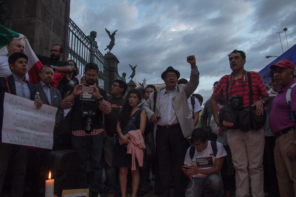
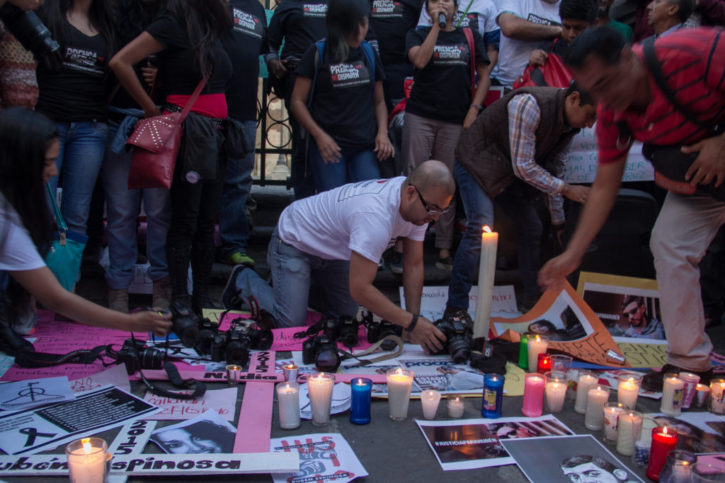
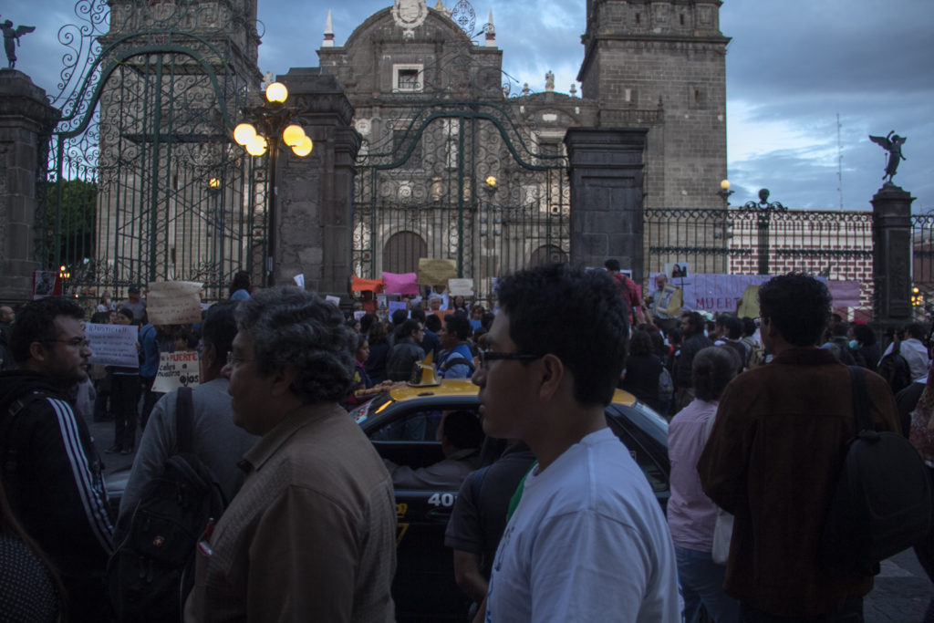
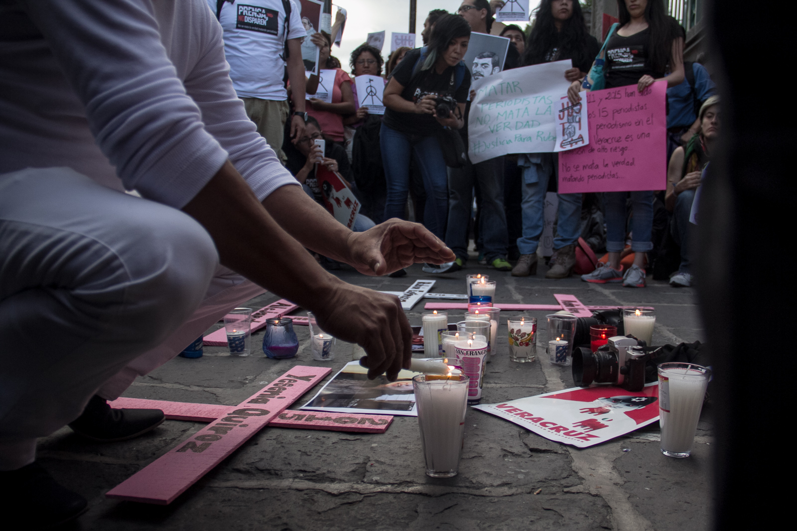
The indignation of the country resulted in an almost immediate response, as hundreds of journalists, photographers, and activists gathered in the principal cities in Mexico such as Guadalajara, Monterrey, Puebla, Xalapa and Veracruz to demand Duarte resign. A major protest in Mexico City was held at the capital’s Angel of Independence monument, where many people holding signs and carrying masks with Espinosa’s face shouted for justice.

The 31-year-old photojournalist specialized in documenting social movements in Veracruz state. Many of his works were critical of the ruling Institutional Revolutionary Party with which Duarte and former president Enrique Peña Nieto are associated.

Nadia Vera, an activist killed alongside Espinosa, released a video days before the massacre. The clip, posted online, she said that if anything happened to her or her fellow activists, it would be the fault of Duarte and the state of Veracruz.

Following these events, the state of Veracruz and Duarte said little, and Mexicans in general do not expect much to come from the politician. The only statement to come from Duarte acknowledged that the murder happened in Mexico state and not in Veracruz, but said it was a matter for other branches of government to deal with.

More demonstrations and protests are scheduled for next week, and a photo exhibit will be on display in a gallery in Mexico City to commemorate the work of Espinosa.

This next series of pictures is from a demonstration held in Puebla city.

Text and Pictures by David A Córdova


sin título-6441-1

sin título-6369-7

sin título-6279-2

sin título-6434-8

sin título-6400-6

sin título-6383-9

sin título-6427-10

sin título-6443-11

Impassive aesthetics: Lou’s frigid vignette of color

Impassive aesthetics Lou’s frigid vignette of color
Share this
Share

It is rare to come across something so aesthetically pleasing that it requires one to stop staring so as not to strain the eyes from the sheer glaring, doleful beauty found in the pulchritude of its aesthetics. Yet this seems to be the case with the work of the B.C. artist who goes by the pseudonym of “Lou.” Imperceptible, yet still stinging with colors and abstractions, Lou manages to establish the most vain formats of photography and materialize allurement.

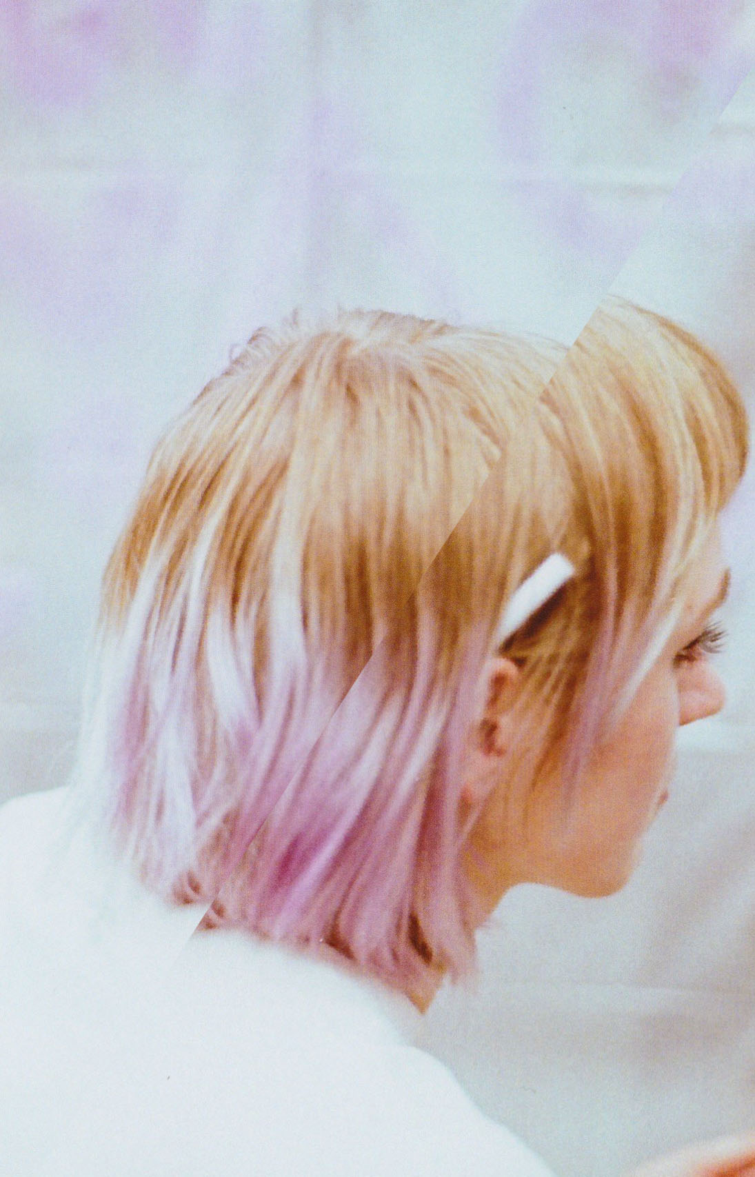
The essence of the creative is brought out through most of Lou’s work, who while at times dealing with gelastic settings, at others captures the essence of the people that surround her. In every photograph she manages to blend colors with cold forms of emotional detachment while still keeping a sense of warmth in the rhythm of color and, I dare say, even in absurdity.

Her work, although it could be interpreted by some as astute to the vanity of humans, is in fact just that, but more so an expression of a part of everyone’s character. In other words, we all enjoy “eye candy,” and to deny this truth is to go against the most innate part of human nature. The desire to be exposed to beauty in all its forms is a desire we all hold, which is perhaps one of the reasons why Lou has amassed a decent following around the world, some even as far as Russia.

Lou, who during the day goes by Mary-Jolene Scott, has been heavily immersed in photography for the past three years, where she has been involved in shoots with numerous fashion and clothing designers in the Lower Mainland. Her most recent work with designer Jennifer Williams led to a series of extravagant shots in what seems to be the dead center of some far-off desert. What is most interesting however is that Lou puts a great deal of effort into the design of her sets, with a methodical preciseness in lighting. When one looks at her photographs it is not hard to see that magnetism comes infallibly with exactitude.
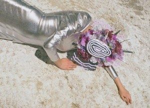
Lou

In a phone interview with The Speaker, when asked why she creates, she answered: “I just do it because I can,” which prompted this journalist to seek no further truth, and even lead him to realize that the congruence of her character is very much in tune with her work. Although aloof and cold, it is still alluring. One does not need to go even beyond the artist-name she has picked for herself — which was based on Lou Reed — to understand the image she is trying to convey.

Her work, detached, even dispassionate, might give a sense of a lack of emotion, yet that is the very point to which she aspires. Still, the process by which one comes to such impassive aesthetics is not in fact one devoid of emotions but of a work ethic and passion for her art that is required to produce such work. As mentioned before, although a great deal of her photography deals with gaudy character-types and settings, a more refined anecdote is the fact that she takes photos of people in her community, and sometimes they even pose in her shoots. The social aspects that are very much left behind in Lou’s work do play a salient role in its creation.
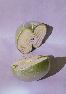
Lou

One of her most alluring works, in my opinion, is the sliced golden apple with transposed lines at the cores. The feeling is that of disunion but not in some sort of “deep” or “metaphorical” manner; rather in the pure character of the apple itself. In other words, lines, forms, and shapes transpire to create a portrait of defined colors captured by a 35mm lens. It is a dichotomy therefore of the reality captured by photography, and the surreal — namely the lines and shadows which seem hypnagogic yet are still very much part of the “photographic” canvass.

In another piece, where the body of what seems to be a female covered with intent by a flaccid mask and decorated with bright flowers, we find again very much an example of the detached, almost Millais-styled “truth to beauty” that Lou tries to portray in her work. The individual body is present, yet its identity is concealed by a material cover. I dare say that behind the mask lies a frigid stare, although that is not for the viewer to experience but only to ponder.

LouAlthough photography is sometimes decried as a medium for the mediocre, Lou shows that creativity is not in fact so bleak of a course when it comes to snapping images that have depth to them and even delicacy. Her work is therefore proof that design, photography, fashion and art are innately linked to each other — in a Dalaunay fashion — and that together they form Lou’s vignette of color.

When asked where she sees herself in five years, she promptly responded: “famous,” giving again an impression of confidence that is parallel with the cheek of her photography.

Critique by Milad Doroudian.
Photographs by Lou
Model: Coco Clark
What Is Tilt Shift?… And Some Amazing Van Gogh Examples

tilt-shift photography
Share this
Share

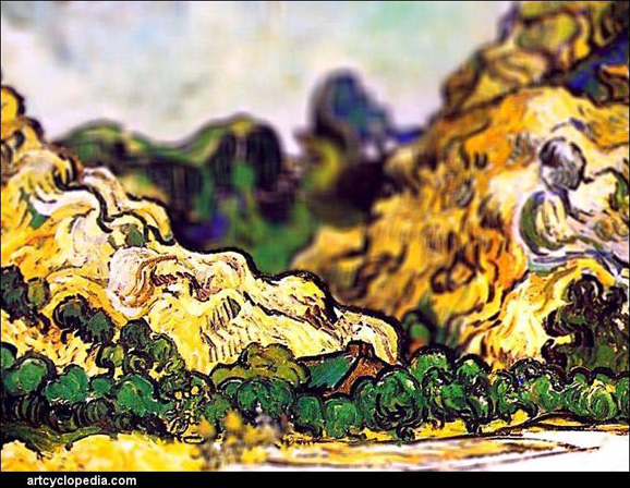
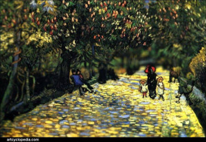
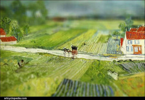
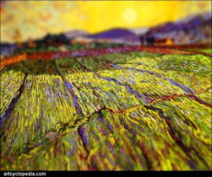
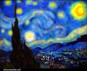
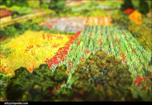
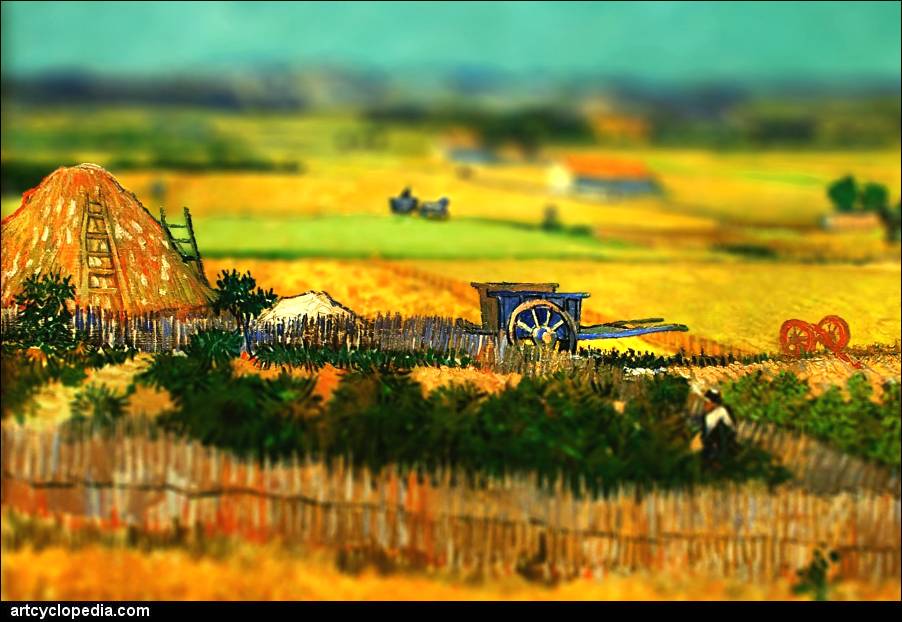
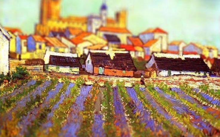
What is tilt-shift and how is it used? Some examples — these amazing Van Gough scenes — of tilt shift will give a good context. But there’s more than one way to create the effect of these images, as you’ll later find out in this article. However, you probably want to learn how to do it with a camera, so we’ll start there.

tilt-shift tilt-shift tilt-shift-van-gogh-mountains-at-saint-remy-detail tilt-shift tilt-shift tilt-shift tilt-shift tilt-shift-van-gogh-starry-night-over-the-rhone-detail (1) tilt-shift-van-gogh-the-harvest-detail tiltshift-Vincent-Van-Gogh-villag-view-flower-field-736x459

What is tilt shift?
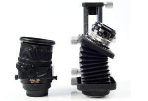
Tilt-shift is what happens when you use a “tilt-shift lens on your camera. As you can see, it’s tilted.

tilt-shift lens

The above image is what photographers usually use. You can actually make your own, though, and this photo gives an even better idea what the lens is doing. The one on the left is a store-bought Nikon tilt-shift lens. The second one is a kind of home-made version made by Dutch photographer Henk van Mierlo, and it uses an Ebay-purchased Nikon Bellows PB-4, a camera often discarded. (Van Mierlo used a 135mm lens on it rather than the regular 50mm because the 135mm lens allows you to focus at infinity, but it also needs an enlargement, which van Mierlo also kind-of home-made by drilling a hole in a body cap and adding some silver tape to make if fit tightlyScreenHunter_5445 Jul. 24 16.56)tilt shift lens

The shifter (really just an angle-piece for the base of a lens) can also be made any other way. Some people 3D Print them, but you could even just seal light out with black tape and hold your lens on an angle.

What does a tilt-shift lens do, then? It allows the photographer to shift focus from the person in front to the person in the very back of vice-versa.

SO, that means you can keep your focus on the guy in the back while other things happen in the front.

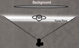
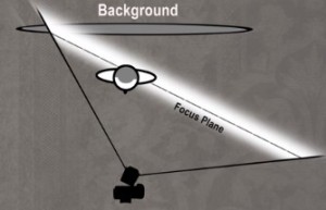
Here’s three images. The first one is what you normally see in your camera — it’s focused on the person, leaving the background out of focus. (Images by The Slanted Lens)tilt-shift explainedIn the image below, the lens is swung to the right. Look at the focus plane. You can expect anything along that line to be in focus — a normal lens can’t do this. The background and the person (one of his shoulders) are both in focus on the left side of the frame, so it looks like the foreground is out of focus while the middle and background are in focus.tilt-shift explained

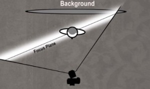
And in this image below, the person is in focus, but one of his shoulders is out of focus, and so is the background, in part of the frame. So everything is out of focus except the persons face and one shoulder — kind of a vertical line of in-focus surrounded by a blur.

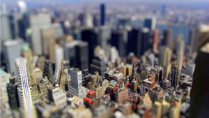
tilt-shift explainedSo that’s what the lens is and does. But really that’s not very impressive, because you can pretty much modify your focus anyway — with your camera and later with blur on your computer. So what’s the secret to the strange toy-like images of van Gogh or cityscapes like this one by Neil Roberson (New York)?

Neil Roberson

What’s the secret?

When you see these amazing images, you may notice that part of the effect is dramatically shallower depth-of-field. The lens is working like lenses do when we’re dealing with super-macro photography (macro lens for up-close shots). So we think we might be seeing something tiny.

You’re also seeing a high-angle shot. This is a shift on your lens — i.e. the camera points at an lens that is angled to the side. You’re not seeing a tilt — which is when the lens is raised up higher or lower against the camera, which creates a distorted-image effect.

NOTE: You can also use the shift to keep focus on the entire length of a small object in macro photographer. For example, if you’re shooting a ruler on a table, you can maintain focus on the entire length of the ruler with a shifted lens, which, as you remember from the three grey images above, means that the focus plane can be moved any way you like it.

How to create a tilt-shift effect without a lens… on your computer

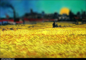
You can adjust a photo’s contrast, color saturation, and depth of focus. This is actually the technique used to make the van Gogh images above. Note that in these images, created by Artcyclopedia, nothing was added to the paintings. The creator of the images above just manipulated the light and adjusted which areas of the frame were in focus.

Is this article worth sharing with other photographers and van Gogh enthusiasts?

By Andy Stern