Fox News Will Reveal Identity of Soldier Who Killed Osama bin Laden

Share this
Share

Fox News Channel (FNC) will reveal the identity of the killer of Osama bin Laden in an upcoming two-part documentary.

The program will be hosted by Fox’s Washington correspondent Peter Doocy, and will feature an interview with “The Shooter,” as Fox is referring to the US Navy SEAL who shot dead Osama bin Laden in May 2011 in Pakistan.

“The Shooter” will, according to the news network, reveal his identity and speak publicly for the first time.

The SEAL “will share his story of training to be a member of America’s elite fighting force and explain his involvement in Operation Neptune Spear, the mission that killed Bin Laden,” according to FNC. “The documentary will provide an extensive, first-hand account of the mission, including the unexpected crash of one of the helicopters that night and why SEAL Team 6 feared for their lives.

“It will also touch upon what was taking place inside the terrorist compound while President Obama and his cabinet watched from the White House.”

Read more: Osama bin Laden Was Killed in 2011 – Documents Seized: up to 1 Million – Released to Date: 17

“The Shooter” will offer never before shared details, Fox has said, including his “experience in confronting Bin Laden, his description of the terrorist leader’s final moments as well as what happened when he took his last breath.”

The documentary will also show a secret ceremony at New York’s National September 11 Memorial Museum, at which event “The Shooter” donated the shirt he was wearing during the 2011 mission.

“The Man Who Killed Usama Bin Laden” (sic) will air on Fox News Nov. 11 and 12 at 10 p.m.

By Joseph Reight

Dubai Twin Towers to Be World’s Tallest

Dubai to Build World's Tallest Twin Towers (2)
Share this
Share

Plans for the world’s tallest twin towers have been unveiled by Emaar Properties in Dubai, United Arab Emirates (UAE). The oil-rich Persian Gulf city will construct the towers as part of its Dubai Creek Harbour project.

The twin towers will be the centerpiece of the project, and will be developed in three phases by Dubai Holding. The design of the towers resembles two rocket launchers.

“The story of Dubai and the history of the creek are intertwined, it really tells us where it came from and which way we’re going,” said Mohamed Alabbar, chairman of Emaar, the company currently building Dubailand and Dubai World Central. “This is the greatest spot in the world and it deserves something creative and special.”

“Planned on an open site, Dubai Creek Harbour will combine the city with the natural contours of the creek,” Emaar said in a statement. “With no legacy ties to infrastructure, this new Dubai will leapfrog many of the world’s other global cities. The master plan is an order of magnitude larger than Downtown Dubai and will support its commercial and cultural development.”

Dubai to Build World's Tallest Twin Towers (2)

The start date for the construction of the twin towers has not been decided.

“When planning a project like this, you can’t look at 2015,” said Alabbar. “It’s about the fundamentals of the city.”

But the plan has not been impeded by the recent worldwide financial crisis which reached Dubai around 2010.

“I think all the stakeholders in Dubai in this business learnt their lessons and they have matured,” said Alabbar. “What it boils down to is supply and demand.”

By Joseph Reight

John Lennon Letter Praising Yoko Ono Fetches $28,000

John Lennon Letter Praising Yoko Ono Fetches $28,000
Share this
Share

A letter, penned by former-Beatle John Lennon to radio and television host Joe Franklin and praising the music of Yoko Ono, has sold for $28,171. The two-page handwritten letter was dated December 13, 1971, and was written in an attempt to get Ono onto Franklin’s New York TV show.

“I know you’re a musician at heart!” Lennon writes in the letter. “And especially I know you dig jazz. Well, Yoko’s music ain’t quite jazz but to help you get off on it, or understand it, please listen to a track on the Yoko/Ono/Plastic Ono Band, called ‘AOS,’ which was recorded in 1968 (pre Lennon/Beatles!) with Ornette Coleman at Albert Hall London, you could call it free form, anyway Yoko sits in the middle of avant-garde, classic, jazz—and now through me and my music—rock ‘n’ roll!”

The songs referred to by Lennon were on Ono’s solo album, “Fly.”

John Lennon Letter Praising Yoko Ono Fetches $28,000 (3)The letter also included a thumbnail sketch Lennon drew of himself and Ono, and was written on official Apple Records letterhead–the label started by the Beatles in 1968.

The letter was successful, reportedly.

“Yoko was on my show nine times,” Franklin commented recently on the events of 1971. “John Lennon was on three times. Yoko was only with him one of those times. Part of his whole thing was to convince her to be confident enough to do it on her own.”

The letter sold for $28,171–far above its presale estimate of $15,000-20,000–at the RR Auction in Massachusetts.

By Joseph Reight

John Lennon Letter Praising Yoko Ono Fetches $28,000 (4) John Lennon Letter Praising Yoko Ono Fetches $28,000 (1)

Men and Women Judge Art Differently, According to New Study

Men and Women Judge Art Differently, According to New Study
Share this
Share

Whose art is worth more? The ordinary painter who just took up the craft or the authentic artist who has spent 20 years working at it and believes he will paint until he dies? According to a new joint marketing study, women and men judge the value of art differently, and how an artist is presented could have a significant effect on how much of the $65bn worldwide art market he or she will claim.

The research looked at the responses of 518 subjects–male and female–to two unfamiliar paintings which were each accompanied by a fabricated artist biography. Some participants read a biography that described the artist as an ordinary painter who only recently took up art. Other participants read a biography that described a much more authentic painter.

Men and Women Judge Art Differently (2)
Stephanie Mangus

“The more authentic artist was described as having been painting for over 20 years and believes they will paint ‘until he dies,'” Stephanie Mangus, assistant professor in MSU’s Broad College of Business and an author of the report, told The Speaker.

Both male and female subjects were found to be more willing to buy the more authentic artist’s work and to pay a higher price for that work.

However, males were much more likely to base their decisions on the artist’s “brand” than females, according to the research.

Women were more likely to “go through a complicated process of actually evaluating the artwork,” the researchers found.

“Regarding the complicated process,” Mangus explained to us, “women rely more heavily on the attitude they form toward the art itself, even if they are not an art expert, when determining their behavioral intentions toward the art (purchase and purchase price). Women rely more strongly than men on their own judgments of the actual piece of artwork. Men, in contrast, place more emphasis on the attitude they develop toward the artist when making these same downstream decisions related to purchase and price.”

The research has several implications, for both business and the everyday art viewer, Mangus told us.

“On the management/business side, we would like the folks that manage artists and other creative sorts (and even brands) to understand that authenticity is important to consumers. Consistency between an artist’s authentic ‘story’ and the image/brand they present to the outside world factors into how consumers judge them and their work. Ultimately, whether or not artists make any money off of consumers is partially a function of their authenticity and ability to convey it.

“On the consumer side, it’s a nice note to the non-connoisseur that they can still make evaluations of art and not shy away from making these types of decisions.”

The findings may extend to other creator-based product industries as well, such as clothing, shoe, jewelry and restaurant and food industries.

“While designers and chefs oftentimes operate in the background, this research suggests that more emphatically communicating their passion and commitment to their craft could significantly benefit that brand’s image and sales,” the team found.

The report may also help to fill in the dearth of consumer research relating to the steadily growing art market, according to Mangus, which has outperformed the equities market during the past 10 years of growth.

“For the average person trying to purchase art, knowing something about the artist–and knowing that the artist is authentic–can reduce the risk of buying a worthless piece,” Mangus stated. “All consumers in the study, but especially men, evaluated art with a strong emphasis on how motivated and passionate the artist was. So if you’re an artist or if you’re managing an artist, developing that human brand–getting the message across that you’re authentic–becomes essential.”

The report was authored by Julie Guidry Moulard from Louisiana Tech University, Dan Hamilton Rice from Louisiana State University and Carolyn Popp Garrity from Birmingham-Southern College, in addition to Mangus, and was published in Psychology & Marketing.

By Joseph Reight

Public Votes Pluto Is a Planet at Harvard-Smithsonian Meeting

International Astronomical Union Meets to Define Planets, Votes Pluto Should Be a Planet Again
Share this
Share

The Harvard-Smithsonian Center for Astrophysics held a meeting last week to discuss the definition of what a planet is, and whether Pluto–which had its planet status removed in 2006 after a vote by the International Astronomical Union (IAU)–should be considered a planet. Three experts paneled the meeting, and each argued for or against Pluto as a planet. The audience then voted.

Pluto has not been considered a planet since 2006, when the IAU met for the same purpose.

In 2005, the discovery of an object, later called Eris, which was farther out than Pluto, and which was larger and more massy than Pluto, disrupted the nine-planet concept of the Solar System. Astronomers met to make a final decision on the definition of a planet at the 26th General Assembly of the IAU in the summer of 2006.

At the 2006 meeting, astronomers voted on the definition of a planet and the status of Pluto. They had three options: maintain the traditional nine-planet Solar System, add three planets of similar size to Pluto–including Eris and Ceres–or remove Pluto and adopt an eight-planet Solar System.

Controversially, they voted for an eight-planet system. Pluto and Eris became “dwarf planets.”

The IAU decided three criteria needed to be met to be considered a planet: the object must orbit the sun, it must have sufficient gravity to pull itself into spherical shape, and it must have “cleared the neighborhood” of its orbit. Pluto had not achieved the last of these criteria.

Today, many astronomers and the public are still uncertain about what exactly defines a planet, but the meeting last week reconsidered the definition, and Pluto.

Three experts presented their case, and the audience voted on the status of Pluto.

One expert, Gareth Williams, associate director at the IAU Minor Planet Center, who was opposed to making Pluto a planet, argued, “Jupiter has cleared its neighborhood. Earth has cleared its neighborhood. Ceres, which is in the main asteroid belt, hasn’t. Pluto hasn’t. In my world, Pluto is not a planet.”

However, the two other experts thought Pluto should be a planet. Historian Owen Gingerich thought that the concept of “planet” is one that is culturally defined and changes over time, and Dimitar Sasselov, director of Harvard’s planetary program, thought that a planet was the smallest spherical lump of matter formed around stars or stellar remnants, so Pluto qualified as a planet.

The audience voted, and found in favor of Pluto being counted a planet.

By Joseph Reight

The Full Debate About Planets and Pluto:

[su_youtube_advanced url=”https://www.youtube.com/watch?v=2RNGSuFqmro”]

More information: Universe Today

Art of Logo Design: Massimo Vignelli: “There was no need to change”

Massimo VIgnelli
Share this
Share

“There was no need to change. It’s been around for 45 years,” said designer Massimo Vignelli, famous for his work on corporate identies in the 60s and 70s, who died May 27. The statement was made in response to the 2013 replacement of one of his most famous works, the logo for American Airlines–the red and blue “AA.”

Massimo VignelliThe logo was created by the design team of Lella and Massimo Vignelli, who together had worked as the Vignelli Office of Design and Architecture in Milan since 1960.

“Every other airline has changed its logo many times, and every time was worse than the previous one. Fifty years ago there were very few logos in general. Somebody started to do logos and people started thinking that logos were important, and now there is a plethora and so many don’t make sense. You see the pages of the sponsors of a concert or an exhibition, and at the bottom there are 50 different logos. It’s ridiculous. A word is so much better.”

Massimo Vignelli The “AA” logo was used for almost half a century–from 1967 until 2013, when it was replaced by a new, “patriotic” paint job. The “AA” was painted on the tail of the old “Silver Bird,” which featured red, white and blue horizontal stripes and the joined word “AmericanAirlines” in Helvetica above a polished aluminum fuselage. The new design has the jets painted solid white body with an American flag-tail and the word “American.”

Of the new design, which was designed by FutureBrand, Vignelli said, “It has no sense of permanence. The American flag is great. I’m designing a logo now for a German company, and I’m using black, red, gold, and yellow. Why? Because national colors have a tremendous equity. They’re much more memorable. It rings the bell of identification. But the American flag has 13 stripes, right? Not 11. Did American add only 11 stripes [to the flag on the tail] because they are in Chapter 11? I don’t think two more stripes would have been a disaster. And there are only two colors shown instead of all three. So is it a different flag?”

Vignelli also said of the paintjob, “As you know, one of the great things about American Airlines was that the planes were unpainted. The paint adds so much weight that that brings an incredible amount of fuel consumption. For some reason they decided to paint the plane. The fact is, weight is weight.”

Choice of font was important in Vignelli’s design. “Legibility … is a very vignelli_associatesimportant element of an airplane. So we used Helvetica, which was brand new at the time. And we wanted to make one word of American Airlines, half red and half blue. What could be more American than that? And there were no other logos then that were two colors of the same word. We took the space away, made one word, and split it again by color. It looked great. The typeface was great. We proceeded by logic, not emotion. Not trends and fashions.”

Of the change, Vignelli said, “Now they have something other than Helvetica that’s not as good or as powerful. Then they did a funny thing: Some may see an eagle [next to it], some may see something else. And they don’t even say it’s the eagle—they say it could be the eagle.”

The plane that featured Vignelli’s design also bore an eagle, but the design team refused to design the eagle for American. “When we originally designed the logo, I designed without the eagle. They wanted an eagle. I said, ‘If you want an eagle, it has to have every feather.’ You don’t stylize and make a cartoon out of an eagle. Somebody else did the eagle, by the way.”

Massimo VignelliTo the question of American Airlines recent bankruptcy and it’s undergoing rebranding, as well as courting a merger with U.S. Airlines, Vignelli said the effort, unless there is a substanial change in the running of the company, is “a wolf camouflaged by sheep.”

Vignelli also made broader statements about his personal design aesthetics during his lifetime. “I like design to be semantically correct, syntactically consistent, and pragmatically understandable. I like it to be visually powerful, intellectually elegant, and above all timeless.”4707898059_1b86e82e91_b_verge_super_wide

“Design is a profession that takes care of everything around us,. Politicians take care of the nation and fix things — at least they are supposed to. Architects take care of buildings. Designers take care of everything around us. Everything that is around us, this table, this chair, this lamp, this pen has been designed. All of these things, everything has been designed by somebody.”

“I love my work because ‘design is one.’ It’s one profession, one attitude. As Italians, we have a long history of codifying design in this way. It has existed for centuries. It was the same for Leonardo da Vinci. In Italy, after the war, we had to do everything … architects like myself did everything … The discipline was thesame. The way of thinking, coming up with solutions, was always the same. The mental process was the same and the mental process was discipline.”

“I think that it is my responsibility to make the work better than it is.”

“The life of a designer is a life of fight—fight against ugliness,” Massimo Vignelli said in the 2007 documentary “Helvetica.”

Massimo Vignelli “Yes, my style is minimalist. Every language has its rules, everyone has his own style and rules, and that’s why every house is different. My style is more minimalist. You need to take away, take away until there is something left.”

“Design is much more profound. Styling is very much emotional. Good design isn’t—it’s good forever. It’s part of our environment and culture. There’s no need to change it. The logo doesn’t need change. The whole world knows it, and there’s a tremendous equity. It’s incredibly important on brand recognition. I will not be here to make a bet, but this [new logo] won’t last another 25 years.”


By Joseph Reight

Vignelli

FutureBrand

American Airlines

The History of Tie Dye

tie dye
Share this
Share

Tie Dye is an art–or a composition of several arts–of much variation. Tie dying creates images geometric, random or representational, and chance also contributes to the result. The artisan or artist shapes the work to a chosen degree, but human control cannot be absolute.

trad_shiboriTie dying originates in 8th century Japan and Indonesia with Shirabori (a Japanese word referring to an object wrung, squeezed or pressed). Shirabori encompasses a wide variety of resist-dying techniques.


From Japan’s many shirabori techniques, two were employed internationally. In Malaysia and PlangiIndonesia, plangi was picked up–a technique of gathering and binding cloth–as well as tritik, a stitch resist textile painting process. In India, bandhani was and is a tritikprocess of plucking and binding cloth in small points.

Various cultures have used resist dying for at least 6000 years–in now-Columbia, Peru, the Silk Road, the Middle East and the Indian subcontinent, although most of this was dying of threads before sewing, which could not be considered tie dyingbandhani

Dying was done using berries, lichen, flowers, shrubs, vegetables, nuts and other natural dies on plant fibers from cotton, hemp and rayon and animal fibers like wool, depending on the materials available in the region.1920sIn the U.S. in the 1920s, directions were given on how to decorate homes and clothing using tie dye (for more example of tie dying in the 1920s, click here).

Tie dye was picked up again in the 1960s by the hippie movement, who wore tie dye clothes and decorated their houses, vehicles and album covers with tie dye patterns. To see actual video footage ofimages (4) the first hippie tie dye experience, on an acid trip at a river along the trip taken by the Bus Further, click here.

By Joseph Reight


Tie dye shirt invention by hippies on acid was actually caught on film in 1964 [Video]

Invention of tie dye
Share this
Share

As shown in the recent documentary “Magic Trip,” “tie dye” was invented in 1964 on the trip taken by the Merry Pranksters across America, and the actual moment of innocent creation was filmed by the crew of what would become known as the first hippies–although at the time there was no word for what they were except the names they gave themselves. Driving through the Arizona desert, the bus was searching for “The Cool Place” when Neil Cassady, the driver of the bus, veered off the road toward a small pond and got the bus stuck in the muddy sand.

Because they would be stuck for a while, waiting for their messenger to ride a motorbike into town for assistance, Kesey wanted to take LSD. The acid was mixed into a jar of orange juice and passed around for everyone to take a drink. The movie cameras that had been brought along to document the trip were set up in various spots around the river as the Pranksters started to wade into the pond.

Sometime into the trip, Kesey decided he wanted to see what it would be like to pour bright colored model paint into a small arm of the pond. The varicolored paints floated and marbleized. The pranksters put Zonker’s white t-shirt in the water under the paint and lifted it up, “and invented tie dye.”

Invention of tie dye


The narration of the pond trip includes a presentation of the setting not done justice to in the short clip. To watch the video, which unlike any other document gives a real live-action quasi-experience to the times of the first hippies–and for the first time, because the hundreds of hours of tape collected on the trip was out-of-sync with the recorded audio and could not be edited until the advent of recent editing technology.

For those curious about the history of tie die before the 60s–it dates back to 8th century Japan and was even popularized in America in the 1920s–click here.

By Joseph Reight

Images: Magic Trip

[su_youtube url=”http://youtu.be/uoXQWZJqMa0″][su_youtube url=”https://www.youtube.com/watch?v=EsQ63m4hLN0″][su_youtube url=”https://www.youtube.com/watch?feature=player_embedded&v=ctbc9kw1oHA”][/su_youtube]

Art of Camera Design: Masazumi Imai on X-T1

Fujifilm X-T1
Share this
Share

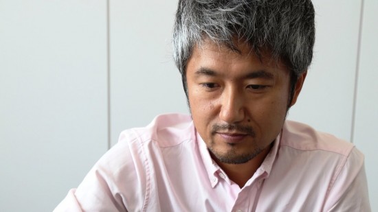
Masazumi Imai, the designer of Fujifilm’s X-series cameras, spoke recently about his philosophy and techniques working on the X-T1, which consider heavily the relationship between progression and tradition in design.

“If I want to play my favorite song, I want to choose my favorite guitar,” said Imai in a recent interview, in which he discussed the X-T1. “It’s the same with cameras. If I want to take a photograph of something important to me, I want to choose a special product.”

“Our X design is classic and authentic. I could have chosen an ergonomic style but our X design is completely different. It’s flat and straight and based on ‘good-old-days’ camera style.”1974st901s

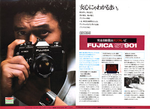
“Late ’70s to ’80s SLRs were very cool to me. The ST901 was very small with a very characteristic finder, so this was very close to the X-T1 concept. Very simple, not so ergonomic — this was the basic inspiration.”

Imai also spoke about the functional aspect of the camera while designing. “Cameras are capturing machines,” said Imai, “but they also express peoples’ minds.”

The question of the return of the center-mounted viewfinder hump, which Imai said was a physical necessity as much as anything else, caused Imai to relate, “We really wanted to break through the barrier of the viewfinder. The EVF is always regarded as something inferior to the OVF, but we really wanted to change that perception.”Art of Camera Design: Masazumi Imai on X-T1

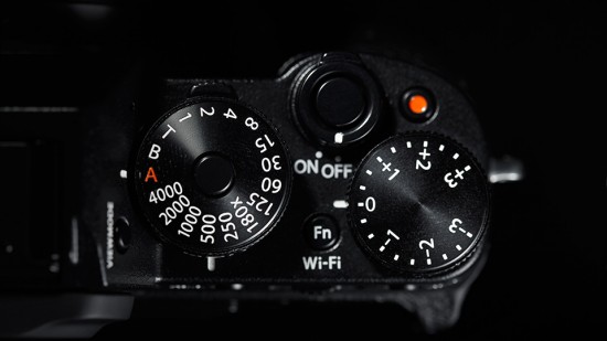
Of the X-series’ dial-heavy control scheme, which Fujifilm believes is a more efficient and enjoyable way to shoot than the abstracted, context-sensitive wheels used by most competitors, Imai said, “The X series is a new combination, the dials and digital. At first, film cameras with dials were common, then it changed to PASM with automatic cameras. Next came digital cameras with PASM that were also automatic. But now, we should be coming back to the standard.”

Imai traced the design shift back to 1985 and Minolta’s Alpha 7000 camera, the first use autofocus and automatic film advance, which designers compare to the shift in automobiles transmission toward automatic.

Imai designed the camera not for everyone. As is expressed on the Finepix X-100 website, “Beyond the praise of a million people, we wanted to design a camera that would be loved by 100,000.”

Imai said, “These are cameras designed to be used manually by people who know what each physical control is for; there are no automatic sports or portrait modes as found on almost all competing models. Nowadays we don’t need special technique, the camera does everything. We think we should go back to basics. The photographer can control the camera, the camera doesn’t control the photographer.”

Imai talked about the question of pleasing everyone. “Basically we asked a lot of professional photographers, and if we asked a hundred people, we’d probably get a hundred different answers. Maybe in the future we can provide some kind of a service where the customer can come to our support center and we can customize that sort of thing. Because there is no perfect answer.”Art of Camera Design: Masazumi Imai on X-T1

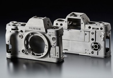
A few design mistakes in the X-T1 were commented on by the designer. The buttons on the back of the camera, flush with the body and bearing little tactile response, Imai said were so designed partly because of the camera’s weather-sealing, and partly because raised buttons can be susceptible to accidental presses. “But it is a little difficult to control — especially the focus point. For example, the movie button — many customers say that this is too easy to press. So that is the kind of thing that we should improve as soon as possible.”

The consideration of the experience of the camera as a familiar and understood tool, or “metaphor”–as it is described on the Finepix site–is something Imai has commented on before. When asked about the Sony RX1 in 2012, Imai said “I think many customers want a bigger sensor with first rate design. Sony’s answer is the RX1. Of course, I like that kind of camera but it is completely different to our series because the design is too modern.‘

On the Finepix X100 site, Imai’s design philosophy is described personally: “We wanted to communicate both the nostalgic ‘vintage’ feeling of the exterior and the authentic cutting-edge qualities inside the camera.”Art of Camera Design: Masazumi Imai on X-T1

“The aim of the product design team is to inspire people to identify with the product and encourage them to enjoy using it. In the case of the X100, I drew on my own personal experience and tried to imagine how people felt when they first encountered a camera – the sensation when they held it and felt the first stirring of the desire to frame and shoot a photo, and then I aimed to translate this comfortable intimacy inherent to a camera into a concrete design.”

It is a philosophy expressed by others on the X-100 team. “At a glance, anyone knows it’s a tool for taking photos,” according to Kazuhisa Horikiri Design Manager at the X-100 Design Centre. “Anyone who sees it, immediately associates it with capturing high-quality photos.’ The transformation of impressions such as these into a concrete form is where the design team started.”

The design team spent time considering every detail of the camera. One of the most concerning choices was that between real and synthetic leather. “Right up to the end of the design process, the team agonised over the choice between the experience when the material is displayed or touched versus the functionality of long-term use, but on final analysis, the priority on the concept of the camera as ‘a tool for taking photos’ determined the selection of the high practicality of synthetic leather.”

The design team set out to create a question with a question asked at the outset: “What kind of camera would we really want to own?’ The answer was a design that not only meshed with every one of our senses; from the manual operating systems of the viewfinder and other functions to the feel of the body materials, but one that also put a priority on fine details that accented its true nature as a camera and its comfort as a tool.”Art of Camera Design: Masazumi Imai on X-T1

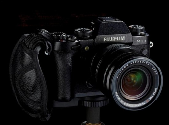
“Our aim has been not to find a generic standard that would appeal to any person around the world, but to focus on people for whom the camera held a special place in their hearts and evoked strong feelings, and to appreciate the lifestyle and the word spread by the owners of such a camera. We have put importance on the interaction (communication) that occurs between the camera and people when they pick a camera up and hold it to their eye, when they operate the aperture ring and dials, when they hear the sound of the shutter, or when it is just adorning a shelf. At such a moment, I am certain that your own unique ‘X100 Story’ will begin.”


By Joseph Reight


Sources:

Finepix X-100