Vancouver Art Gallery: So Far, Biggest Voting Segment “Really Can’t Stand It,” Want It Stopped

Vancouver Art Gallery
Share this
Share

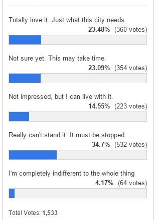
The design for the new Vancouver Art Gallery has been published, and although so far opinions are split widely about designers Herzog & de Meuron’s vision, the largest voting segment on CBC’s poll is, “Really can’t stand it. It must be stopped.”

Of 1,533 voters 532 said they “couldn’t stand” the new design. Very few of those who responded said they were “indifferent” (4 percent). About 15 percent said they were “not impressed” but could live with it. 23 percent said they “weren’t sure yet and needed time.” The same percentage — a quarter of respondents — said they “totally loved” the design.

Some Canadians criticized the design as looking like a pagoda, being outdated in style, and being built “like Lego.” Some also referred to the inukshuk, a traditional indigenous Canadian symbol popular in the city. Those who approved of the design said it was “exciting” and “something cool happening in Vancouver.”

Vancouver Art Gallery

A lot of commenters expressed strong feelings about the designers chosen not being Canadian.

“It does not look Canadian or West Coast! Don’t we have a West Coast architect with a Canadian design?” wrote one such commenter.

The new plan is a 310,000-square-foot wood design 20 stories high, and would be built in downtown Vancouver on the site of what is currently a parking lot at West Georgia and Cambie Street.

The site was donated by the city on condition the Vancouver Art Gallery would raise an estimated $300 million needed for the project. So far, funds raised fall far short of that. $23 million has been vouched by the Vancouver Art Gallery board of trustees.

The designers were chosen in 2014. World class designers Herzog & de Meuron have done a number of famous art galleries and museums around the world, including the Tate Modern in London and the “Bird’s Nest” in Beijing.

Participate in the poll (click) or comment (below).

Splendour And Misery: Painting Prostitution At The Musée d’Orsay In Paris

The Gallien Girl
Share this
Share

PARIS — Women of the night and their artistic impact is the subject of a major exhibition at the Musée d’Orsay in Paris. The show focuses on prostitution seen through the eyes of painters between 1850 and 1910. This extraordinary undertaking, whose title is borrowed from Honoré de Balzac’s controversial novel ‘Splendeurs et Misères des Courtisanes’ (The Splendours and Miseries of Courtesans), aims to unveil the faces and bodies of prostitutes as a genuine and rich source of inspiration for the painters of the period.

The mid-nineteenth century generated an effort to depict a concrete contemporary reality with a new desire to reject Romantic modes of idealization in art and literature which opened a new range of subject considered worthy of representation. The prostitute’s body as the ultimate anti-academic subject matter previously considered socially inappropriate could eventually be brought in the frame and became emblematic of the modernist gaze. Widely represented across canvas and texts, prostitutes became a symbol for modernity and embodied modern life itself.

From Van Gogh, Manet to Picasso or Munch, the exhibition features various generations of painters across several countries. As already suggested by its title, the exhibition also intends to examine the contradictory connotations of disgust and beauty associated with prostitution. Yet if some artists emphasized the ‘misery’ of it in their work while others chose instead to highlight its ‘splendour’, artists were all operating under the prism of fascination. Whether as cubists, impressionists, postimpressionists or expressionists, all were trying with a particular brush to reveal this disorienting world of the unseen sometimes lugubrious, sometimes colourful, no matter the technique of representation.

As they were experimenting and looking for new pictorial ways of representing prostitution, the subject was treated very differently depending on the painter’s artistic vision. Rather than reproducing scenes accurately and realistically, painters like Edgar Degas or Constantin Guys based their visions mainly on fantasies, suggesting and sublimating the noisy brothel atmosphere through unconventional techniques. Some chose to paint the common spaces of prostitution such as streets, harshly illuminated rooms or the dark interiors of ‘cafés-concerts’ and ‘music-halls’, while others preferred the intimate details of a face or a body.

Along with its artistic impact, the event also examines the social and cultural aspect of prostitution through Salon painting, decorative arts, sculpture and photography. In addition, various documentary and archival materials made available to the public highlight the ambivalent status of prostitutes from the splendour of the ‘demi-mondaine’, a pleasure girl living on her wealthy clients, to the misery of the ‘pierreuse’, an often clandestine street walker.

The social subject of prostitution is still a complex one nowadays. The fact that the Musée d’Orsay decided to conclude the year with a celebration of artistic images of prostitution has a particular resonance in light of the latest debates on the subject in France. We cannot but connect it to the recent decision of the French senate to scrap important sections of a government-backed law on prostitution that brought hundreds of prostitutes in the streets of Paris and other French cities last April. In spite of this resonance, whether taken as a subtle reminder of the still open debate on the controversial prostitution law in France or as a pure celebration of nineteenth century artistic imagery of prostitution, this impactful event is definitely not to miss.

‘Splendour and Misery — Pictures of Prostitution, 1850-1910’
22 September to 17 January 2016 – Musée d’Orsay, Paris
Pictures of Prostitution

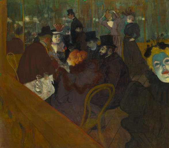
‘At the Moulin Rouge’, 1892, Henri de Toulouse-Lautrec, The Art Institute of Chicago
Pictures of Prostitution

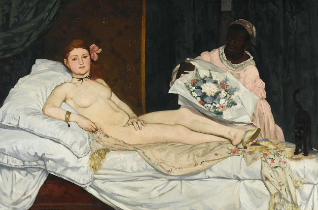
‘Olympia’, 1863, Édouard Manet, Grand Palais, Paris
Pictures of Prostitution

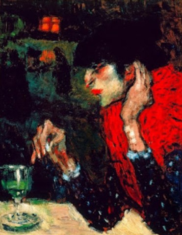
‘The Absinthe Drinker’, 1901, Pablo Picasso, Hermitage Museum, St Petersbourg
Pictures of Prostitution

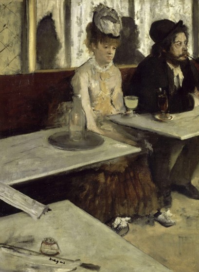
‘The Absinthe’, 1873, Edgar Degas, Grand Palais, Paris
Pictures of Prostitution

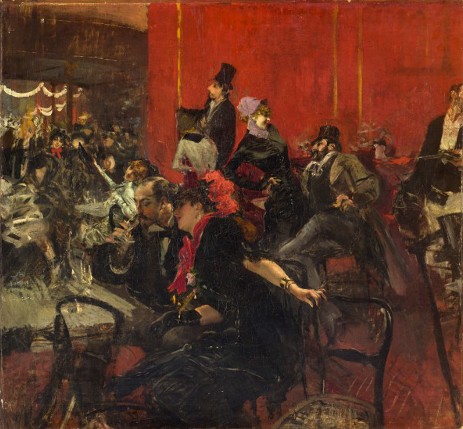
‘Party at the Moulin Rouge’, 1889, Giovanni Boldini, Grand Palais, Paris
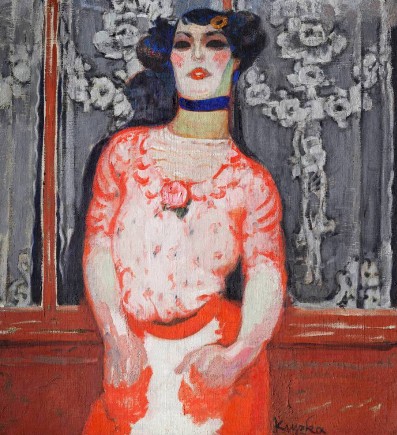
Pictures of Prostitution (4)

‘The Gallien Girl’, 1910, Frantisek Kupka, Národni Galerie, Prague
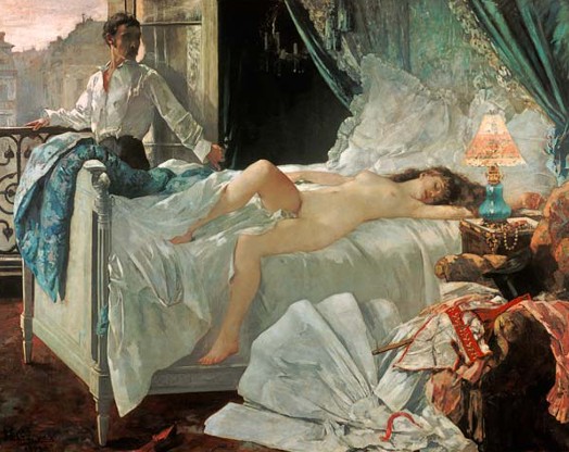
Pictures of Prostitution

‘Rolla’, 1878, Henri Gervex, Grand Palais, Paris

Pictures of Prostitution

‘The Wait’, 1848, Jean Béraud, Musée d’Orsay, Paris

By Pauline Schnoebelen


Tatsumi Kimishima: New Nintendo President

Tatsumi Kimishima
Share this
Share

In a press conference at the Osaka Stock Exchange in Osaka, Japan, newly appointed Nintendo President Tatsumi Kimishima spoke to reporters regarding the state of the company and what direction it was headed in. Kimishima previously served as the president of Nintendo of America from 2002 to 2006 until he handed over the reigns to current Nintendo of America President Reggie Fils-Aime.

Aside from his obvious contributions to the popular Pokemon franchise, Kimishima has a corporate background as he worked for the Sanwa Bank of Japan for 27 years. He has served as the Chief Financial Officer for The Pokemon Company and the president of Pokemon USA Inc. Kimishima has also served as the Managing Director of Nintendo since 2013.

The organizational restructuring of Nintendo was made in September partly due to an unexpected turn of events earlier this year. Kimishima fills the void left by former Nintendo president Satoru Iwata, who died on July 11, 2015 due to bile duct cancer. Much like Iwata, when he first took over as Nintendo President in 2002, Kimishima is not well known among gamers and game critics. Unless you are an avid follower of Nintendo and you study the names behind the daily operations of the company, you probably wouldn’t be too familiar with Tatsumi Kimishima’s work. It is also interesting to note that Kimishima is 65 years of age — 10 years older than Iwata when he last held the position of president.

Kimishima takes over at a time when Nintendo is in a transition period, realizing that the Nintendo Wii U hasn’t been winning the race in console sales against the Xbox One and the Sony Playstation 4. Shigeru Miyamoto and Genyo Takeda will oversee software development for Nintendo, taking on the roles of “Creative Fellow” and “Technology Fellow” respectively while Kimishima will handle the administrative side of Nintendo. Kimishima is said to have a different management style and business approach compared with the former president.

Game editor analysis: In my opinion, while they made a safe pick in selecting him to lead the company, I also believe that Tatsumi Kimishima will do just fine as the new Nintendo President. He has the experience working in a similar role and he has great knowledge of the company. Considering that he doesn’t intend to change the direction where Nintendo is going, it seems to me that Kimishima will fit right in with the everyday core operations of Nintendo. Sometimes it just makes sense to stay in house when making a key hire like this one.

By Steven Vitte

5 Artworks Not To Miss At Centre Pompidou’s Latest Exhibition Of Mona Hatoum

Mona Hatoum Twelve Windows
Share this
Share

Born in Beirut in 1952, Mona Hatoum is of Palestinian descent and British nationality. This latest exhibition of an unprecedented scale has gathered over 100 works of this leading contemporary artist in various media, ranging from performance, video, photography, works on paper to installation and sculpture. Some of the must-sees are highlighted for you here to spend more time experiencing and understanding them.

Mona Hatoum Grater Divide
“Grater Divide”
  1. Grater Divide, 2002

Hatoum’s artistic practice often features modifying or scaling up familiar objects from daily life into threatening or hostile sculptures up to human proportions. This cold and solid room divider was based on a foldout cheese grater and now aggressively blocking the view of visitor across the exhibition room. If standing close enough, one may even have the feeling of going to be peeled.

Mona Hatoum Light Sentence
  1. Light Sentence, 1992

This installation made up of piling square wire mesh lockers gives an illustration of animal cages. It also reminds of stacked and uniform architecture not unfamiliar to large cities. Thanks to up and down movements of the simple household lightbulb hanging in the centre, the walls of the dedicated exhibition room was showered with enchanting shadow patterns while the moving shadows give visitors swaying feelings as though they are on a boat sailing in the sea.

Mona Hatoum Map Clear

  1. Map (clear), 2014

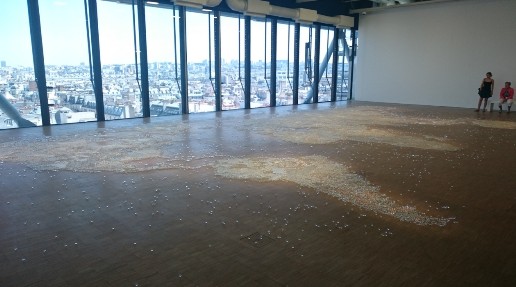
Definitely no one would have missed this large world map consist of numerous glass marbles lying on the floor in front of the view of Paris city. All the marbles of this amazing piece are not fixed to the floor, infusing a sense of instability and vulnerability as movements of viewers may possibly shift parts of it or even destroy it. It also creates an unwelcoming surface to pass or walk on. Map is also a recurrent theme of Hatoum’s works, quite some other works with this theme can be found in the exhibition too.

Mona Hatoum Twelve Windows

  1. Twelve Windows, 2012

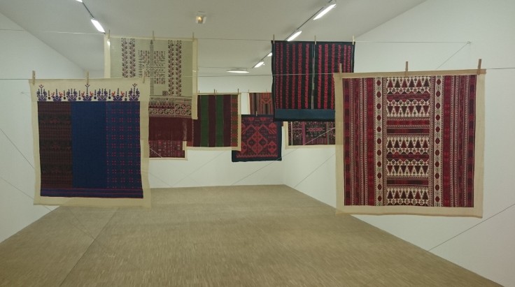
This beautiful installation of twelve pieces of Palestinian embroidery hanging in a room by steel cables may not be the most attention-seeking. However, its subtle beauty originates from the artist’s determination to preserve the traditional skill of Palestinian needlework which is endangered by exile and dispersion of Palestinians all over the region. Each ‘window’ symbolises a key region of Palestine.

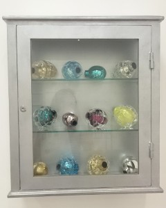
Mona Hatoum Natura Morta (Medical Cabinet)

  1. Natura Morta (Medical Cabinet), 2012

Those seemingly appealing objects exhibited in a medical cabinet are actually in the forms of hand grenades in colourful glass. They are presented as precious objects to be aesthetically appreciated by viewers. However, they are marked with malevolent undertone at the same time. Thinking of the series of Medicine Cabinets by Damien Hirst, this is slightly more visually alluring and underscored by stronger tensions.

There are absolutely much more to see and experience at this exhibition. The wide range of works actually enables us to understand the significance of the artist’s works in today’s art world and to appreciate the diversity and versatility of Mona Hatoum’s artistic practice.

By Rickovia Leung

“Human” — What Does It Mean?

Human
Share this
Share

The human experience on Earth. This is what French photographer and director Yann Arthus-Bertrand tried to capture in his last movie ‘Human,’ which premiered Saturday simultaneously at both the 72nd Venice Film Festival and the United Nations in New York City.

While some qualified ‘Human’ as the Godfrey Reggio’s ‘Koyaanisqatsi’ of our generation, Yann Arthus-Bertrand reportedly got inspiration from Terrence Malick’s ‘Tree of Life’ (Palme d’or at the Cannes Film Festival).

After his 1999 worldwide-acclaimed best seller photo-essay ‘Earth From Above,’ filled with stunning aerial photography of Earth, and his 2009 praised documentary ‘Home,’ which has been broadcast in 14 languages, Yann Arthus-Bertrand, a stalwart defender of the planet, presents his latest highly anticipated and ambitious work ‘Human.’

‘Breath-taking,’ ‘powerful,’ ‘authentic,’ those were some of the words whispered by the first members of the audience to step out of the cinema after the projection. This intense and compelling three-hour documentary presenting the extraordinary stories of ordinary people from around the world clearly did not leave the public indifferent. ‘Human’ received a standing ovation after its premiere at the Venice Film Festival in presence of the entire film crew, themselves in tears and very moved by the reaction of a stirred public.

“I think the only way to make people think is through emotions. Not through the brain — through the heart,” the director said during an interview at the Venice Film Festival.

Close up faces genuinely staring at the audience with a simple dark grey background, no context nor name, age, nationalities or explanations but only eyes, mouths, tears and voices telling about their stories, memories and thoughts. This is ‘Human’. Mothers, fathers, fighters, victims, children, murderers who were all asked to answer the same questions involving the meaning of life, love, happiness and war among other essential topics. The interviews were selected among more than 2,000 involving people in 60 countries for a period of three years. We do not have to know who those people are but just listen to their words and what they have to tell us about the privilege of being alive.

The compiled interviews are subtly mingled with lyrical aerial nature shots, ranging from enraged waves crushing on rocks and lighthouses, or slow motion close-ups of children riding horses in a green field to the busy enlightened streets and skyscrapers of New York. Sublimated by a grandiose orchestral soundtrack by Armand Amar, cities, oceans, crowds, deserts and forests form the pattern of human experience as the sound of men and women voices mingle with that of the wind and the sea. Through an alternation of powerful images, words and sensations with the help of a dedicate team, Yann Arthus-Bertrand hoped to restore — or awaken — human compassion.

The concluding seconds of the film focus on a visibly touched interviewee in her late fifties addressing directly the film crew. What should have been simple greeting words to the few people present on that day of filming became a message to everyone:

“You’ve brought up a lot of things for me today. You’ve made me feel important. You’ve made me feel that I had something to offer. You’ve made me feel that I had a place to go. You’ve made me feel like my stories were welcome. And you made me feel happy.”

“I think people need to feel that they’ve done something while they’ve lived. They need to feel that they’ve contributed.”

“Today you made me feel that I have contributed, and I am very grateful to that. Thank You.”

‘Home’ and ‘Human’ are both available on YouTube

Human

By Pauline Schnoebelen
Legend Movie Review: Two Tom Hardys, Twice The Mayhem

Share this
Share

Brace yourselves, the biopics are coming in full force

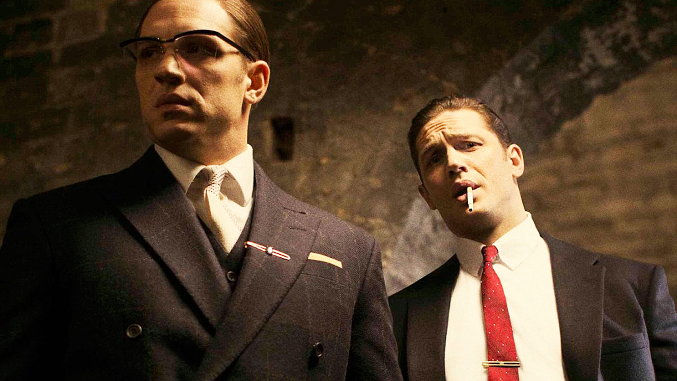
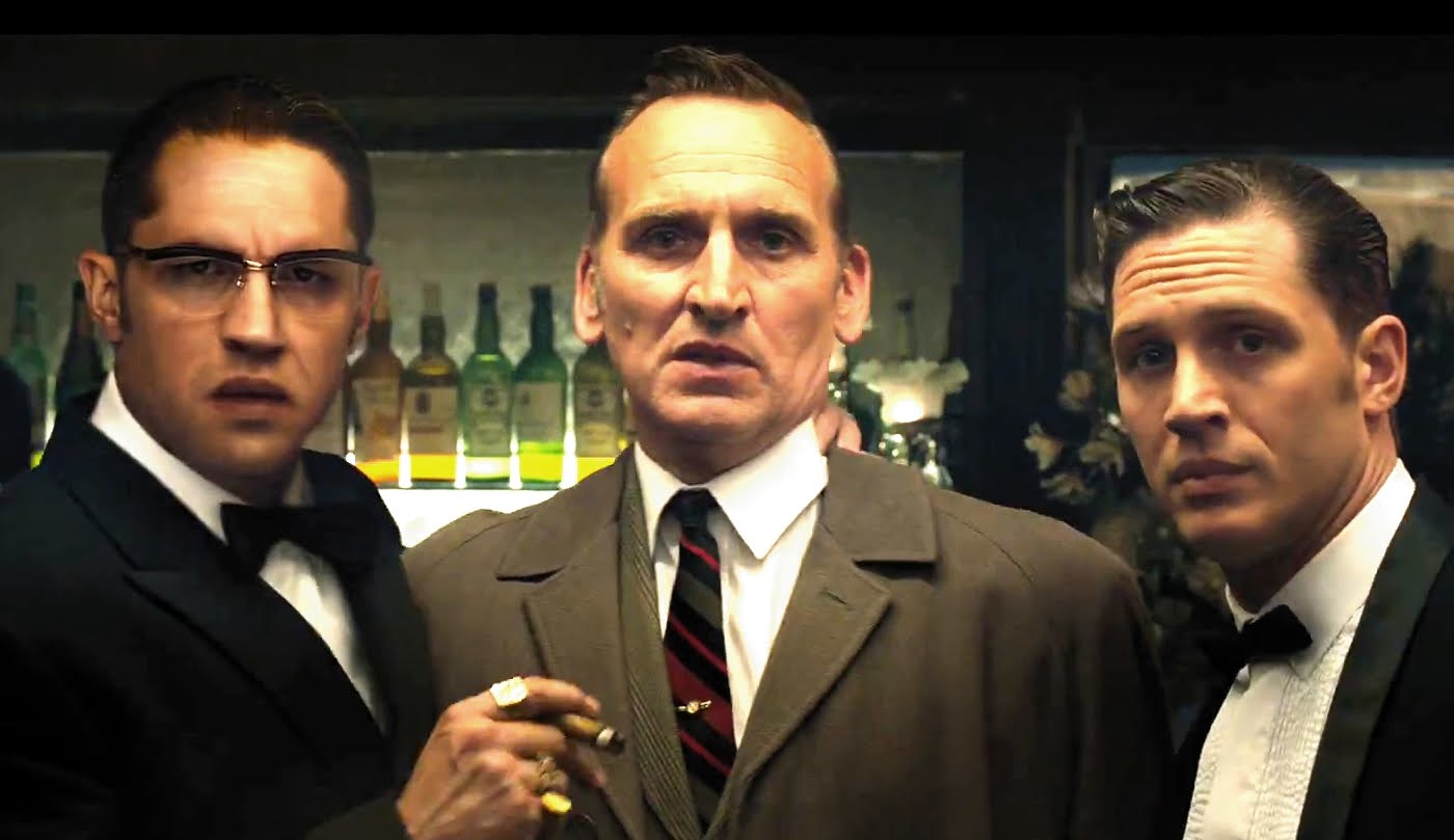
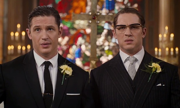
The Oscar bait films are in bound, and to lead the pack is “Legend.” Hot off the heels of “Straight Outta Compton,” “Legend” follows the tale of Reggie Kray (Tom Hardy) and Ronnie Kray (Tom Hardy) as they take over the entirety of the 60’s London underworld. That’s right. For those who know nothing of the film, The Kray twins are both played by the ever-talented Tom Hardy. An interesting gimmick, but how does it work in practice?

Legend-DI-1

Remarkably. Truly remarkable. At first it’s undeniable to see just Tom Hardy, but as the film goes on the two twins really become their own characters. Small nuances differentiate them, posture, facial expression, movement, each tuned to the individual aspects of the specific character. The goal of any actor is to fool the audience into not seeing the actor but the character they portray, a feat Tom Hardy pulls off with ease.

“Legend,” perhaps reflecting the central characters too much, is ultimately a very schizophrenic and split experience in most of it’s presentation. It works in some aspects buy in others it really is a head scratcher. The highlight of the show for many audience members will certainly be Ronnie Kray, the unhinged psychopath of the two. For a film focused on underworld violence, Ronnie proves to be the foil to the typical genre conventions with genuinely laugh out loud dialogue and actions that provide frequent and copious levity. Ronnie’s scenes are the stand outs from the film providing some truly memorable moments. He’s likeable despite his obvious and apparent flaws. This is both one of the film’s greatest strengths and weaknesses.

maxresdefault

“Legend” feels confused and erratic. It jumps from moments of complete levity to those of dire consequences. It constantly pokes fun at the stigma of homosexuality light heartedly, then alternates to the psychological deterioration of another character. It’s jarring to say the least and because of the evident lack of tact the tonal changes take,  the main emotional beats of the film don’t really hit home. Or anywhere close to home for that matter.

The script very clearly favours Ronnie too, with the more level headed Reggie’s character being rejected to development via a simple romance sub-plot that weighs the core themes of the film far further than they should have ever reached. These conversations that Reggie Kray and his romantic interest Frances (Emily Browning) have also have a strange sense of revision, as if one script was edited heavily to include weighty one liners meant to inject some sort of ideological drama into the film where it seems it has no right to be. Pseudo, “deep” lines are placed oddly at the end of conversations for what I can only imagine was to leave a poignant sense in the audience. Not so.

0d21e23b-5de1-43a3-839f-693a9d0c1689-1020x612

“Legend” suffers from what can only be described as a confused tone which leads to an incredibly distracting dissonance between what we’re seeing on screen and what the tone suggests. Perhaps this is what, “Legend” was aiming for, a sense of utter surrealism in the face of preposterous situations yet the totally bizarre scenes are stuck beside supposedly emotionally heavy scenes resulting in a messy, confused and ultimately disappointing final film.

6/10

Review by Alex Reid

Business Better Than Ever At The Last Cassette Factory

Business Better than Ever at The Last Cassette Factory
Share this
Share

Springfield, Missouri is home to the National Audio Company — or as it is colloquially known, the Last Cassette Factory. It’s a fairly self-explanatory name. NAC is indeed the last major producer of audio cassette tapes still in business in the United States — a business that’s better than ever thanks to the retro movement encouraging a growing number of bands and audio producers, young and old, to return to the music-sharing media of decades past.

President of the NAC Steve Stepp has said in numerous interviews that his company was surprisingly unhurt by the large scale move from cassettes to CDs, and from CDs to MP3s. According to production manager Susie Brown, bands today are increasingly driven back toward the “warm analogue sound” of cassettes and records.

Perhaps part of the reason for the NAC’s persistence is that during the heyday of cassettes, the company mainly produced tapes for spoken word performers and blanks for private use. This meant that when the CD wave hit, the company was largely untouched. Fast-forward to 2014 which saw company producing over 10 million tapes – and sales are up another 20 percent this year. Albums being printed on NAC tapes include a Metallica album and a special release of the theatrical soundtrack for Marvel’s Guardians of the Galaxy.

Business Better than Ever at The Last Cassette Factory
Cassette tapes being printed in the factory

Cassettes may be a more tangible and personal way of sharing music — if you ask some people, like music critic Rob Sheffield, cassettes are far more romantic than MP3’s. There’s certainly something to be said for being able to give a friend a painstakingly recorded mix tape in the form of an actual tape, rather than just uploading it to their iPod or posting it online. Cassettes are also more portable than fragile, easily scratched CDs – it’s easy to throw one in your backpack or on the seat of your car, and expensive carrying cases are rarely required.

Undoubtedly the resurgence of tapes relies at least in part on the nostalgia of an older generation who grew up with the tapes and now has the money and influence to start bringing them back to the mainstream, as well as hipsters picking up on the fad of retro music mediums like vinyl. At any rate, especially with new “cassette-only” labels now popping up, it might be time to head down to the thrift store to pick up a cassette player of your own.

By Dallas Jeffs

Human Library Lets You “Check Out” People In Attempt To Foster Diversity

human library
Share this
Share

To foster diversity and inspire acceptance of all, an incredible ‘Human Library’ in Denmark is allowing people to check out “interactive books” for half an hour. Its main difference from a ‘traditional’ library, however, is that the words are coming from humans volunteering to tell their tales.

Readers who venture to ‘The Human Library’ can peruse the library catalog and select an experience to hear about – Child Of The Holocaust Survivors, The Gypsy Tale, Iraq War Veteran, and Orphanage Boy, are examples of story titles offered.

Once a reader makes his or her choice, they are led to a discussion area to meet their book and hear the tale, cover to cover.

The inspiring initiative was started in 2000 by a Danish youth-based nonprofit, “Stop The Violence.” The organization’s intention was to inspire conversation and foster understanding between different types of people that would normally not interact with each other.

As the Human Library Facebook Page shares, “The purpose is to challenge what we think we know about other members of our community. To challenge our stereotypes and prejudices in a positive framework, where difficult questions are accepted, expected and appreciated.”

As GoodNewsNetwork shares, the first Human Library event was hosted at the Roskilde Festival in Copenhagen, one of the largest summer festivals in Northern Europe. The theme focused on community activities to help stop growing levels of violence and bias in the area. Now, the project has spread to over 50 countries across the world.

By Amanda Froelich at TrueActivist.com

Snarkitechture’s THE BEACH Transforms Museum Landscape

Snarkitechture's The beach transforms museum landscape
Share this
Share

The National Building Museum in Washington, DC, has become host to THE BEACH, an installation that emulates a natural landscape while flying in the face of museum tradition. The oddly commercialized, sleek shoreline is a vaguely humorous, somewhat subversive take on multiple modes of summer leisure.

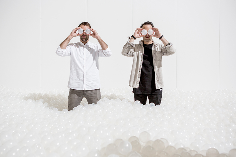
The show, running until September 7th, 2015, is getting most of its press for the inclusion of a 10,000 square-foot ball pit, composed of almost one million recyclable plastic balls in a uniform translucent white. At the end of this ball pit “ocean” is a wall of mirrors that play the role of a distant horizon, providing the illusion that the ocean goes on forever.

Creators Daniel Ashram and Alex Mustonen are the duo behind the Brooklyn-based design collective Snarkitechture. THE BEACH seems perfectly in keeping with the firm’s usual style. Frequently ustilizing stark white objects and often addressing themes of consumerist and design-oriented society, the team specializes in large installations, innovative interior designs, and art projects with a slightly subversive, humorous edge.

THE BEACH is an interesting addition to any museum space, encouraging guests to sit in chairs and idle on its shores, eat organic, fair-trade snacks from the included Union Kitchen snack bar, and to “swim” in the ball pit. All these activities seem to exist in a place of passive opposition to the traditions of a museum, where food is forbidden, guests glance at paintings and sculptures for a few seconds before moving on, and where touching any artwork is strictly forbidden.

It might not be a germ-a-phobe’s paradise, though the museum assures visitors that all of the balls in the pit are molded with anti-microbial agents, as well as being sprayed with anti-microbials and cleaned nightly. The average person should leave the BEACH with their health, but good luck if your phone happens to fall out of your pocket while you swim toward the mirrored horizon.

What is clear is that while the exhibition has been on, the National Building Museum has reported a threefold increase in the number of visitors it’s welcomed during its summer season. Is this sort of interactivity the answer to revitalizing the museum experience? We’ll have to wait and see as more and more artists begin to experiment with the medium.

By Dallas Jeffs

Prom 62 Review: OAE Plays Brahms Under Alsop

Share this
Share

Both Alsop and the orchestra know what they’re doing, but the results aren’t quite magical ★★★★☆

As we move towards the 25th anniversary of Bernstein’s death, his one-time protégée Marin Alsop is moving from strength to strength. Music Director at the Baltimore and São Paulo State Symphony Orchestras, Alsop made history in 2013 by becoming the first woman to conduct the Last Night of the BBC Proms. She returns to the prestigious post again this year: but first she has taken the helm of the Orchestra of the Age of Enlightenment (OAE) in an all-Brahms programme.

A period instrument ensemble, the OAE and associated Choir of the Enlightenment (CE) generally focus on Baroque and classical repertoire. But perhaps this is no bad thing, since Brahms was firmly rooted in the old masters – not least Handel, whose influence can be heard clear as day in the Triumphlied (see below). Alsop, meanwhile, has a special relationship with Brahms, having been profoundly moved by his music in her youth.

The Academic Festival Overture, Op. 80, was a gift to the University of Breslau after it awarded Brahms an honorary doctorate. He bases it, fittingly, on student drinking songs, and it seems to communicate a sense of camaraderie. The OAE were rhythmic and driven throughout. At one point the brass seemed a little loose, and at another I think I heard an oboe flail around, as if the orchestra were still warming up. It was a professional performance but it didn’t thrill me.

The Rhapsody for Alto, Male Chorus and Orchestra, Op. 53 – usually known simply as the Alto Rhapsody – came next. Jamie Barton was the soloist, and her magnificently resonant voice easily coped with Brahms’ theatrical writing. The orchestra showed great control, never dominating the texture. At the entry of the chorus the piece began to resemble a requiem, and no less so at the finish, when the C major resolution suggested a kind of Lux Aeterna-type sentiment. All parties showed outstanding dynamic sensitivity. For me, this was the highlight of the evening.

The little known Triumphlied, Op. 55, was composed to celebrate a war victory. In the first movement, the chorus was very clipped, the scales in the strings clean, the dense counterpoint handled very well. But my attention wavered after that. The solo baritone, Benjamin Appl, had a nasal, strained voice, as if he were about to sneeze at any moment. Still, momentum was maintained, and as the sopranos drove upwards towards the end I got back into it.

After the interval came the centrepiece, Brahms’ First Symphony (Op. 68). The orchestra made sweeping statements in the first movement, the strings sometimes lurching in and out of the sound to give added drama. The double basses were suitably ominous, but the strings’ pizzicato dab at the finish came out messy. In the next movement, despite excellent playing, I was never really moved; at the quiet, freeze-frame conclusion, some of the violins were whiney, which rather ruined the moment.

Things picked up in the trio section of the third movement, the rhythmic motifs here eliciting comparison to Beethoven. At the beginning of the fourth the playing was very emotional, and the next section was brilliantly animated. But after that, for me, came twenty minutes of boredom. Only at certain moments – when the brass took the lead, for example, or when Alsop brought out heavy sforzandi – was I brought back into the music. Naturally the final cadences were big and bold, but the performance won’t stick in my memory. As with the rest of the programme, the ability was there, but there was no X Factor.

By Robbie Carney

Straight Outta Compton Movie Review: Express Yourself

Share this
Share

The biopic is a classic genre in film that usually leads to award season opportunities as well as audience and critical acclaim, but where most biopics focus on those historical characters that are largely considered to be “good” people, “Straight Outta Compton” focuses on the endlessly controversial world of gangsta rap, specifically the pioneering group of the sub-genre, N.W.A.

“Straight Outta Compton” follows rappers Eazy-E, Dr. Dre, Ice Cube, DJ Yella and MC Ren as they form one of the most prolific hip hop groups of all time, and the effect it has on their personal lives. This is the film’s greatest strength, it’s ability to make large personalities relatable and engaging. These are men that, despite their flaws, ultimately sympathetic characters. Their attitudes are summarized in one line by Ice Cube (O’Shea Jackson Jr.), “Our art is a reflection of our reality.” A stinging criticism of general pop culture but a poignant justification for what was at that point in time some of the most controversial music to ever hit the mainstream.

The inter-personal relationships between the characters and their attitude towards their culture is always backed against ever increasing tensions between the police force and the African American communities. N.W.A played a large part in igniting the fuse to a long dormant bomb through one of their most shocking songs, “F**k tha Police.” “Straight Outta Compton” does the moment justice, building up the context, raising the stakes, then delivering a stinging punchline. The song became an anthem for the 1991 riots, ones which are depicted in the film as total chaos, yet for some reasons seem to be relatively short compared to the rest of the film. For a film that spends its first half making a case for social injustice, “Straight Outta Compton” seems to turn in a completely opposite direction just as events were coming to a head. It feels as if the events were obligatory to include, but the film fundamentally wasn’t as interested in the riots as it was in the characters.

MAIN-NWA-Straight-Outta-Compton

A feature film only has a certain amount of minutes to go around, and it’s not an enviable task to juggle around an ensemble cast like this in such a short time but the characters of DJ Yella and MC Ren seem to get shunted to the side, making token appearances every twenty minutes or so the remind the audience that they were part of the group too. Instead, “Straight Outta Compton” opts to focus the most on Eazy-E who is a genuinely engaging character. He is by no means your typical biopic protagonist and he is our window into this world. Jason Mitchell performs remarkably in the role, relaying a man whose rise and fall from fame genuinely affects his psyche.

“Straight Outta Compton” is a musical biopic so naturally the music doesn’t disappoint. The majority of the soundtrack is dominated by late 80’s/early 90’s hip hop, setting the tone and context of the times perfectly. It’s not just N.W.A music either, tracks from other hip hop legends, 2-Pac and Snoop Dogg also drift in and out, no doubt sending ripples of nostalgia through many viewer’s spines. Any fan of the genre won’t be disappointed in the music score.

918e4a29-33ac-4039-8813-c2cb4d1c5dba-bestSizeAvailable

Ultimately though, “Straight Outta Compton” is the biopic with a hard outer shell, but an emotionally mature centre. The trailers would have you believe that, “Straight Outta Compton” depicts the group’s struggles against the social times when in fact it is more about the relationships between the members of the group, and how money and fame can come between great art, for better or for worse. Despite a lack of focus in the middle, “Straight Outta Compton” delivers where it matters providing a memorable biopic, not quite reaching the heights of the greats of the genre, but nevertheless standing proud on its own.

7/10

By Alex Reid