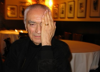
“There was no need to change. It’s been around for 45 years,” said designer Massimo Vignelli, famous for his work on corporate identies in the 60s and 70s, who died May 27. The statement was made in response to the 2013 replacement of one of his most famous works, the logo for American Airlines–the red and blue “AA.”
 The logo was created by the design team of Lella and Massimo Vignelli, who together had worked as the Vignelli Office of Design and Architecture in Milan since 1960.
“Every other airline has changed its logo many times, and every time was worse than the previous one. Fifty years ago there were very few logos in general. Somebody started to do logos and people started thinking that logos were important, and now there is a plethora and so many don’t make sense. You see the pages of the sponsors of a concert or an exhibition, and at the bottom there are 50 different logos. It’s ridiculous. A word is so much better.”
 The “AA” logo was used for almost half a century–from 1967 until 2013, when it was replaced by a new, “patriotic” paint job. The “AA” was painted on the tail of the old “Silver Bird,” which featured red, white and blue horizontal stripes and the joined word “AmericanAirlines” in Helvetica above a polished aluminum fuselage. The new design has the jets painted solid white body with an American flag-tail and the word “American.”
Of the new design, which was designed by FutureBrand, Vignelli said, “It has no sense of permanence. The American flag is great. I’m designing a logo now for a German company, and I’m using black, red, gold, and yellow. Why? Because national colors have a tremendous equity. They’re much more memorable. It rings the bell of identification. But the American flag has 13 stripes, right? Not 11. Did American add only 11 stripes [to the flag on the tail] because they are in Chapter 11? I don’t think two more stripes would have been a disaster. And there are only two colors shown instead of all three. So is it a different flag?”
Vignelli also said of the paintjob, “As you know, one of the great things about American Airlines was that the planes were unpainted. The paint adds so much weight that that brings an incredible amount of fuel consumption. For some reason they decided to paint the plane. The fact is, weight is weight.”
Choice of font was important in Vignelli’s design. “Legibility … is a very  important element of an airplane. So we used Helvetica, which was brand new at the time. And we wanted to make one word of American Airlines, half red and half blue. What could be more American than that? And there were no other logos then that were two colors of the same word. We took the space away, made one word, and split it again by color. It looked great. The typeface was great. We proceeded by logic, not emotion. Not trends and fashions.”
Of the change, Vignelli said, “Now they have something other than Helvetica that’s not as good or as powerful. Then they did a funny thing: Some may see an eagle [next to it], some may see something else. And they don’t even say it’s the eagle—they say it could be the eagle.”
The plane that featured Vignelli’s design also bore an eagle, but the design team refused to design the eagle for American. “When we originally designed the logo, I designed without the eagle. They wanted an eagle. I said, ‘If you want an eagle, it has to have every feather.’ You don’t stylize and make a cartoon out of an eagle. Somebody else did the eagle, by the way.”
 To the question of American Airlines recent bankruptcy and it’s undergoing rebranding, as well as courting a merger with U.S. Airlines, Vignelli said the effort, unless there is a substanial change in the running of the company, is “a wolf camouflaged by sheep.”
Vignelli also made broader statements about his personal design aesthetics during his lifetime. “I like design to be semantically correct, syntactically consistent, and pragmatically understandable. I like it to be visually powerful, intellectually elegant, and above all timeless.”
“Design is a profession that takes care of everything around us,. Politicians take care of the nation and fix things — at least they are supposed to. Architects take care of buildings. Designers take care of everything around us. Everything that is around us, this table, this chair, this lamp, this pen has been designed. All of these things, everything has been designed by somebody.”
“I love my work because ‘design is one.’ It’s one profession, one attitude. As Italians, we have a long history of codifying design in this way. It has existed for centuries. It was the same for Leonardo da Vinci. In Italy, after the war, we had to do everything … architects like myself did everything … The discipline was thesame. The way of thinking, coming up with solutions, was always the same. The mental process was the same and the mental process was discipline.”
“I think that it is my responsibility to make the work better than it is.”
“The life of a designer is a life of fight—fight against ugliness,” Massimo Vignelli said in the 2007 documentary “Helvetica.”
 “Yes, my style is minimalist. Every language has its rules, everyone has his own style and rules, and that’s why every house is different. My style is more minimalist. You need to take away, take away until there is something left.”
“Design is much more profound. Styling is very much emotional. Good design isn’t—it’s good forever. It’s part of our environment and culture. There’s no need to change it. The logo doesn’t need change. The whole world knows it, and there’s a tremendous equity. It’s incredibly important on brand recognition. I will not be here to make a bet, but this [new logo] won’t last another 25 years.”
By Joseph Reight
Vignelli
FutureBrand
American Airlines
 the watchdog of US spending in the country–informed Congress that the trade was poisoning the Afghan financial sector, inflaming corruption, contributing to the success of Taliban insurgents and criminal networks, and threatened to damage progress America has made in its efforts to improve health, education and government in Afghanistan. The problems associated with the opium trade also make it harder for aid workers to work–hampering rebuilding and oversight programs.




 important element of an airplane. So we used Helvetica, which was brand new at the time. And we wanted to make one word of American Airlines, half red and half blue. What could be more American than that? And there were no other logos then that were two colors of the same word. We took the space away, made one word, and split it again by color. It looked great. The typeface was great. We proceeded by logic, not emotion. Not trends and fashions.”


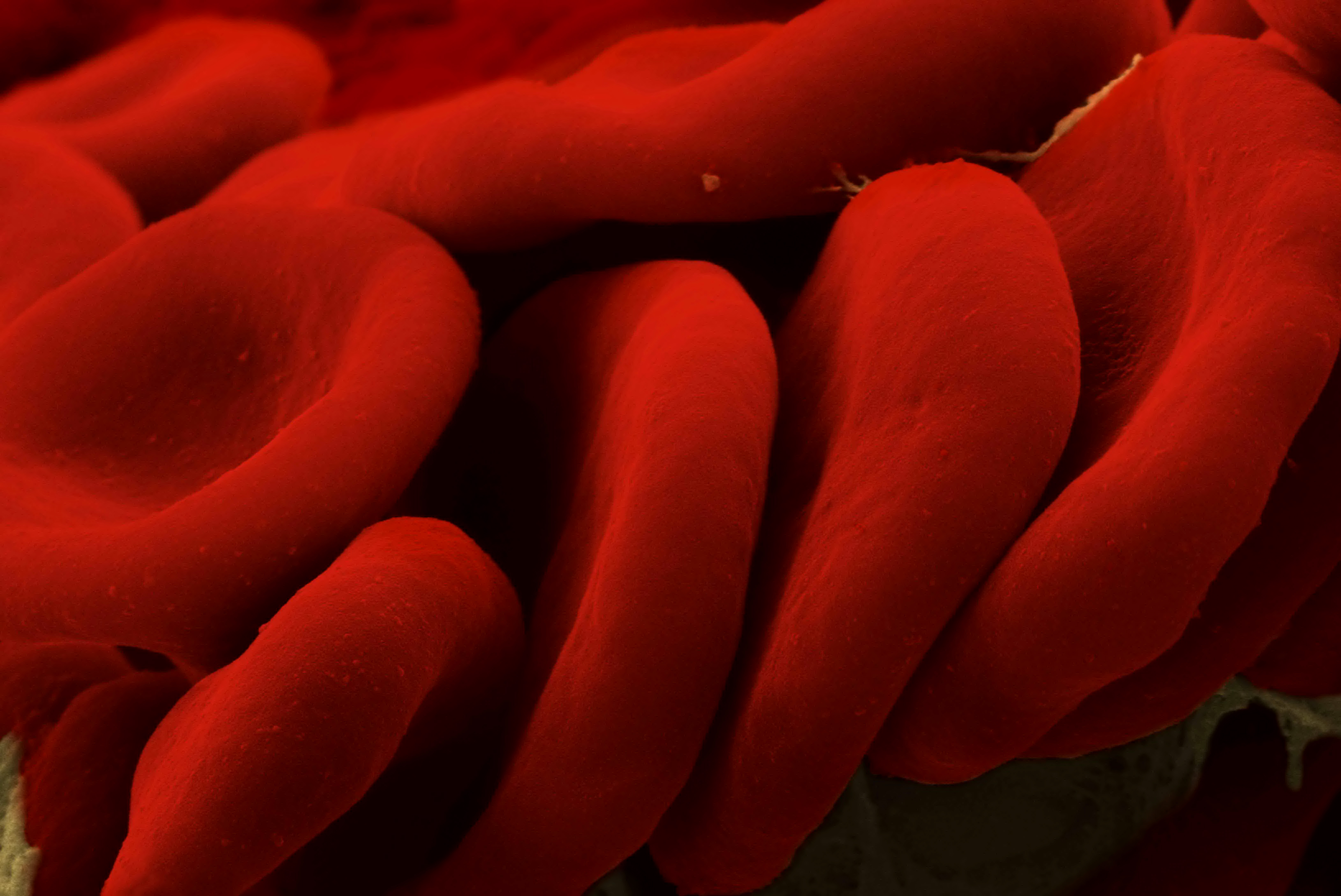

 “It means we could overcome some of the inherent problems with transfusions as there would be no need for blood group typing and a longer shelf life means you are able to stockpile the supplies necessary for major disasters. It also offers the opportunity for routine transfusion support in ambulances or at remote inaccessible locations,” explained Essex’s Professor Chris Cooper, a biochemist and blood substitute expert.
